The best local government websites are like the best local governments; they serve the people, don't frustrate them, and reflect the identity of who they represent. The worst websites… you get the picture.
Online sites meant for counties aren’t like your standard issue, templated websites that only display content and contact forms.
Since their goal is to serve local communities and streamline workflows for government staff, they’re built differently and have a lot going on under the hood.
In this article, we discuss the design practices of top-tier government websites and conclude with a list of sites that exemplify each.
Designing Top-Tier Government Websites: What You Need to Know
Quality design goes beyond trendy aesthetics and intricate CSS coding; it prioritizes the user's overall experience and seamless navigation through the site, from entry to exit.
You don't need to be a trained developer or visual arts major to distinguish between good and bad design—users catch on easily and intuitively.
See below for some key considerations to keep in mind when revamping a government website, regardless of whether you outsource the task or handle it on your own.
Your Website Is an Extension of Your Administration
A government website is a place where people go to do stuff. Civic stuff. As opposed to showing up at a town hall or state capitol, they use either a desktop or handheld computer to interact with their local, state, or federal authorities.
With a well-functioning government website, citizens can quickly access information, make payments, and get important forms without having to make a phone call.
Leading government websites, much like those in the private sector, strive to satisfy user needs. Failing to do so leads to higher bounce rates and wasted resources for everyone involved.
Good design matters. It reduces the hassle of walk-in traffic and time spent on phone calls. Meeting or surpassing expectations will keep your citizens engaged and communication lines open.
It’s All About Communicating and Building Trust
Good design is vital because it makes serving people easier. For instance, web functionality can keep residents safe with accurate, emergency mass notification alerts.
Effective web design addresses the unique needs of your community. Whether your citizens want convenient access to documents and forms or online payment options, your website should make it all happen.
The site should also feature a convenient, responsive design that appeals to everyone regardless of their preferred device.
The best local government websites are also 2-way communication hubs. They can enable residents to engage, meet their civic responsibilities, and make their voices heard online. Accessibility goes a long way here.
Finally, if residents don’t recognize or trust your website, they won’t use it. According to the Nielsen Norman Group, design trends change, but good design, in its own right, is one of the 4 vital factors that affects the site’s trustworthiness.
You must build a consistent image and keep it current to turn your governmental brand into a trusted source of info for visitors.
Shared Qualities of Great Government Websites
Government websites can vary in design, depending on institution, agency, department, and jurisdiction. The best ones may adopt very different approaches from international bodies or single departments of a large organization.
That said, good design is good design. Here are some essential features that leading government websites typically include to ensure they serve their communities effectively.
They’re Interactive
Government websites serve people. The best ones do it with an efficient user interface that helps citizens accomplish whatever they need. This includes well-thought-out URL structures, buttons with clear CTAs, and accessible menus that avoid superfluous animation.
Part of accessibility is understandability. For this reason, well-made sites make use of simple and succinct language.
They’re Easy to Navigate
User-friendly navigation is a cornerstone of leading government websites, ensuring that residents can quickly and efficiently find the information they need. This involves intuitive menus, clear categorization, great internal linking, and robust search functionality that allows people to locate services with ease.
Site size and navigability aren’t mutually exclusive. Great websites can be massive and still point users in the right direction without ever being confusing. This requires careful design. For instance, matching the label text with the target page's title, formatting the dropdown menus properly, and timing mouseover events effectively are necessary.
They’re Not Eyesores
Attractive websites have high engagement because they use coherent imagery to guide visitors through whatever process they need to complete. Applying typography, color theory, and other design principles sitewide will prevent it from looking like an unmitigated mess.
A great government site is always bespoke, with consistent branding and aesthetically pleasing design elements. If it looks like a Y2K fever dream straight out of the dial-up era, nobody will want to use it.
They’re Clean
Simple pages make fewer demands on the user’s attention. Moreover, a less crowded interface makes it likely that the visitor will decide where to go without hesitation or frustration.
Web pages should have clear and consistently formatted hints about what each element does and how to use it, including navigation, forms, and document access.
Town Web’s List of Top-Tier Government Websites
We used the design qualities listed above to identify 5 non-negotiable characteristics of effective government websites:
-
Overall experience: A blend of all the criteria
-
Interactivity and accessibility: People can get things done easily
-
Navigability: No matter how complex, moving from place to place is a breeze
-
Branding and aesthetics: Recognizable, consistent, and elegant design
-
Clean interface: Uncluttered pages that present bite-sized content
Then, we scoured the internet and found sites that blend these criteria to create a cohesive, visually appealing, and functional experience for users. Here’s what we chose.
LA County
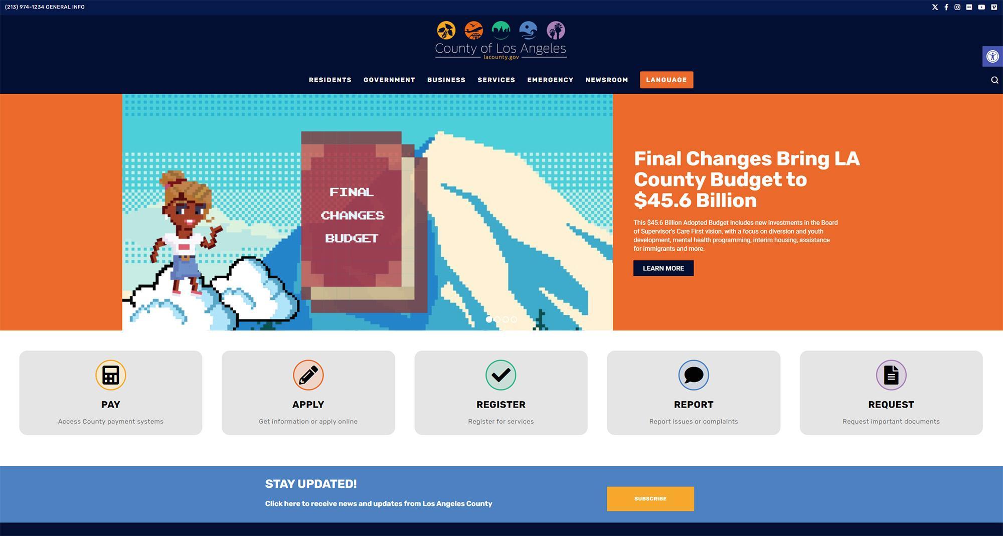
LA County’s official site exemplifies how it’s perfectly alright for municipal websites to not shy away from modern and playful design. The site features contrasting hues of navy and orange; a classic combination in the world of color theory, executed flawlessly.
On the homepage, you’re greeted with a carousel banner that cycles through important statistics and updates, with high-quality, carefully curated media. Then you have an array of animated CTA buttons that let you access the county payment systems, make applications, register for services, report issues, and request important documents.
The header contains a centrally aligned logo; social media links that interestingly include Flickr and Vimeo, besides the usual suspects; an accessibility widget, a search menu, and a beautiful drop-down section.
The latter features highlighted text on mouseover which guides your eye as you browse the navigation menu. Some of these have a “view all” button towards the end, which does the same thing as clicking on the menu title. Even though most users know this intuitively, it’s a welcome addition for those unfamiliar with how these navigation elements typically work.
Functionality wise, the site features a robust search tool and a well thought out URL structure. The bottom of the homepage has a services locator which enhances navigability. if it were up to us, however, we’d have it swap places with the newsletter subscription CTA.
Bexar County
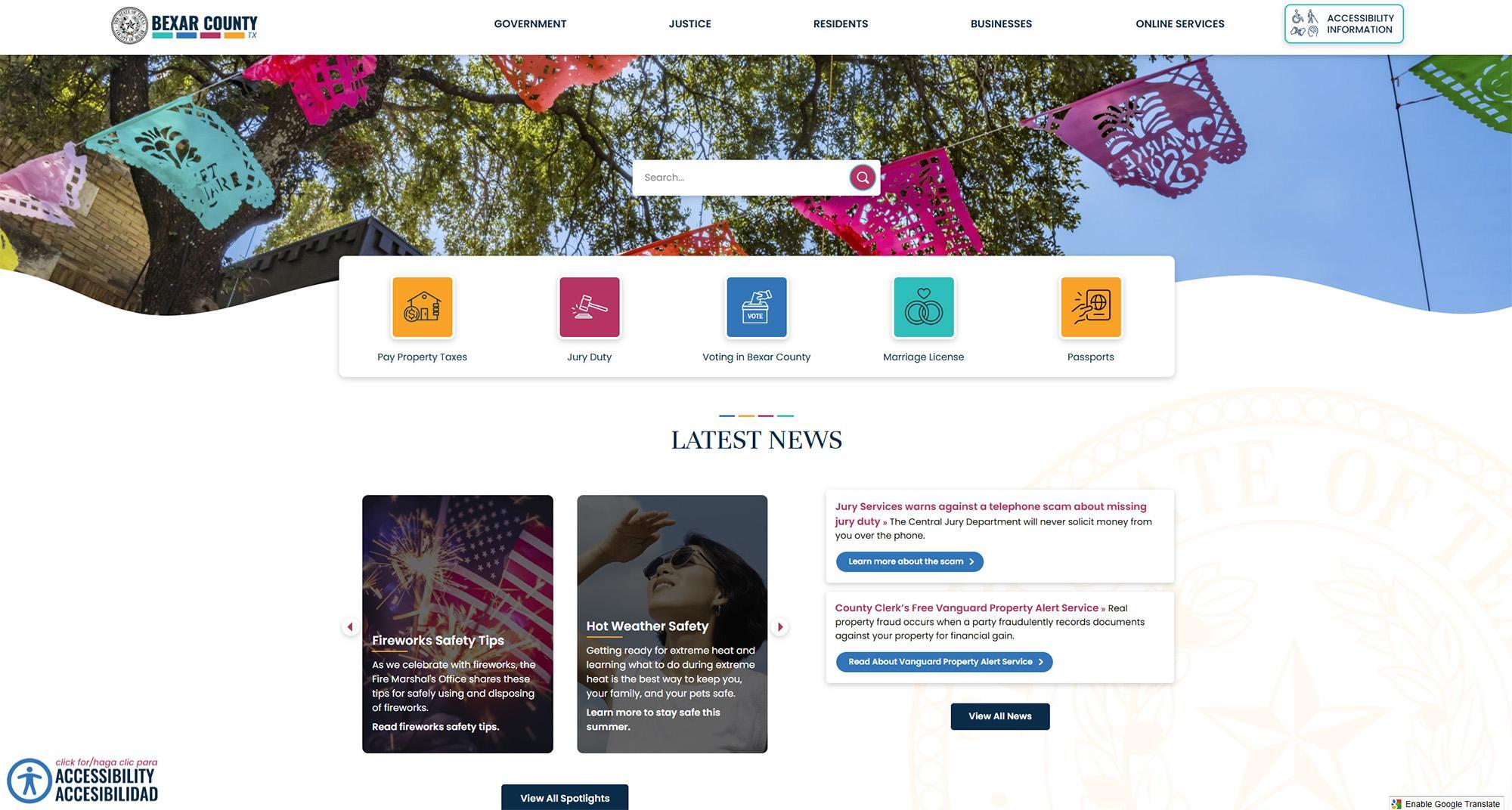
There’s something honest about websites that prioritize functionality, accessibility, and navigability above all else. Bexar County’s website is a testament to the fact.
The moment you open it, the site gets down to brass tacks by displaying the search bar right in the middle of the hero banner. A drop shadow or a darker overlay on the background image would’ve been nicer, but it’s a thoughtful gesture.
Next, you notice the abundantly prominent accessibility information and widget. Clicking the latter gives you complete control over how the information is displayed, with additional tools like a page summarizer, an audio file downloader, text to speech converter, language selection, and more.
The header contains comprehensive page menus that contain links to every page, service, and functionality on the site, further enhancing its navigability.
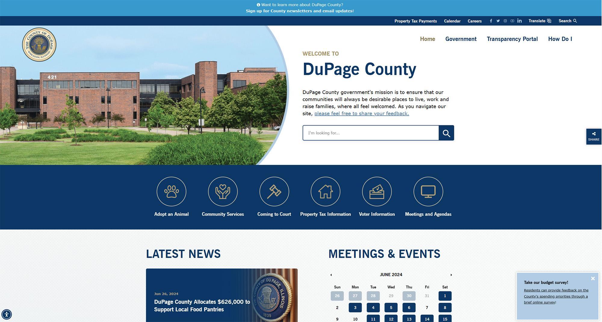
The County of DuPage has done an excellent job with their website; every stylistic choice prioritizes legibility and function without diluting aesthetic appeal.
Readability and contrast levels are near-perfect right out of the box. If needed, you can utilize their comprehensive accessibility tools. With these you can change the text size, highlight links, and make the cursor bigger.
You can also pause animations and hide images, but you probably won’t have to since there are no unnecessary animations on the site. One thing we loved is the designer’s decision to ensure zero overlap between text and images. In instances where there’s text over images, they’ve used thick overlays to keep it readable.
On the hero banner you’ll see a high-res image of the DuPage county administration building. Notice the logo hovering above the structure with the sky as its backdrop; it’s these little details that really make a website shine.
It’s not just the visual elements, the site is technically sound as well, with excellent attention to detail on the UI and UX front. The menus, transparency portal, and “how do I” section offer abundant navigability and access to local services.
Cook County
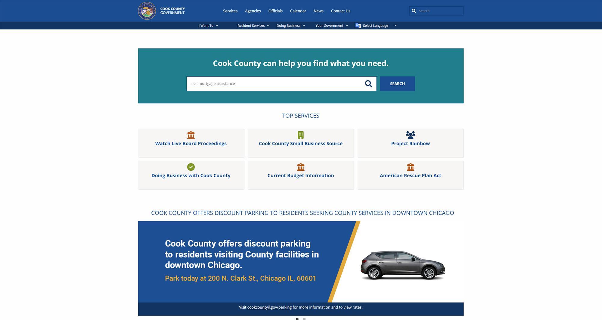
Cook county’s website embodies the “simple is best” ethos and exemplifies how minimal, grid-based layouts will always remain timeless. The colors, though predictable, are a safe choice and make the site feel familiar even for first time visitors.
On the homepage you’re greeted with a prominent search bar that works well and lets you filter by categories once you hit enter. This lets you easily access important resources such as property tax information, court records, and public health updates.
Additionally, the menus have clear CTAs and internal as well as external links to a whole host of information sources and services. Residents can pay property taxes, apply for permits, and access various records directly through the site. This emphasis on digital services enhances convenience and reduces the need for in-person visits to county offices.
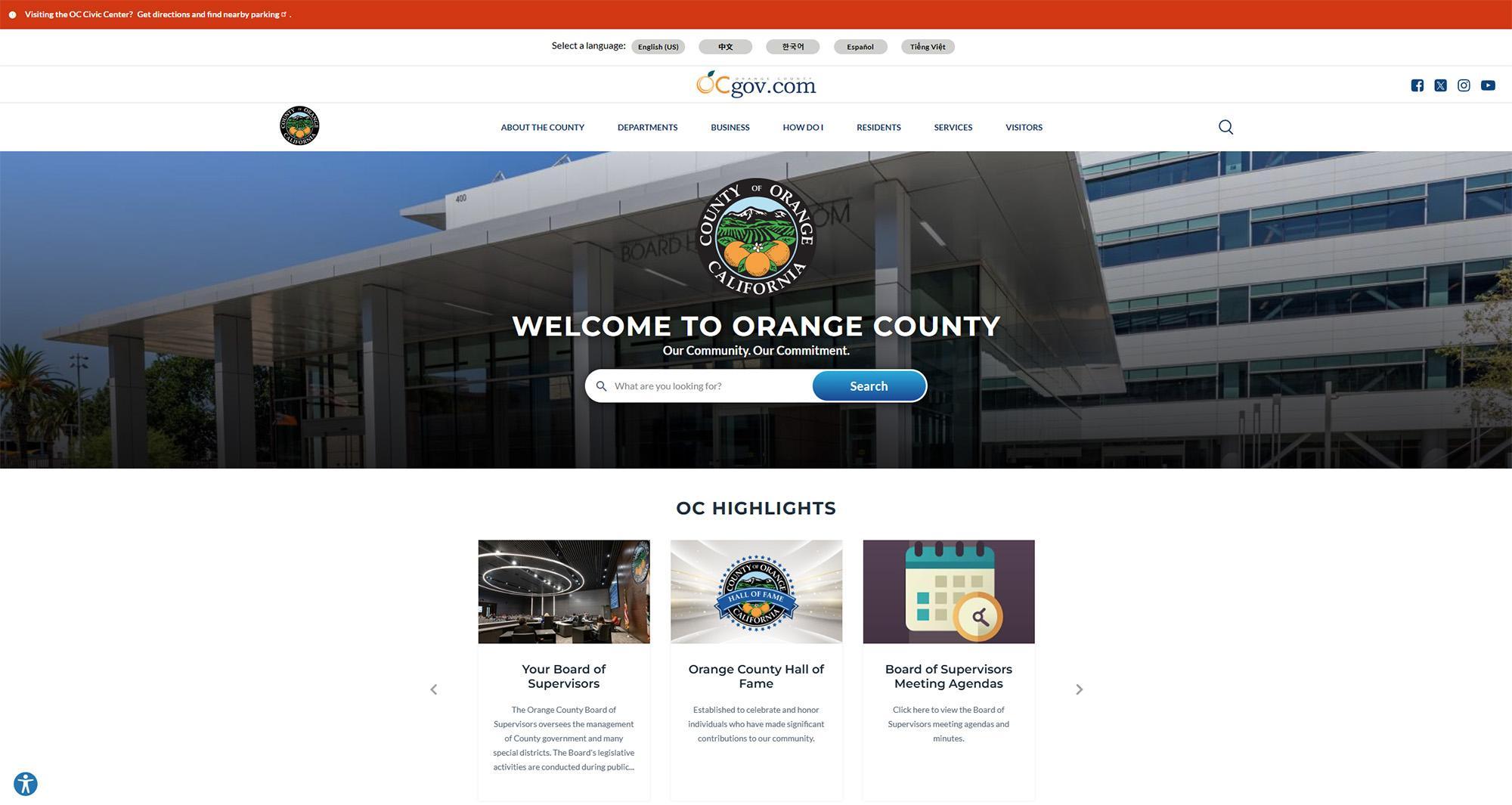
Orange County